Creating...
I've been creating a lot. My ever loving husband has shelled out a bit of money for some new toys, and I've been using them heaps. Partly to make me feel better for asking for money, and partly because, FINALLY my digital taste has improved and I've bought some great stuff, that I really want to use.
You've seen some of it already. 4 of the new Jen Wilson Layers upon Layers sets. And her flowers. Kim Christensen's great Dirty shirt papers and elements too.
So here's some more layouts using them all. Some of them I've been tweaking for a while, and I'm just going to have to say ENOUGH. For better or worse they are done.
 Dotted papers, elements, stitching etc from Kim Christensen's Dirty Shirt set. Background paper from Trish Jones (Family Portrait I think) Eclectic Mix Cd. Inked edge action from AtomicCupcake.com. Fonts used are AL Postmaster, 4990810, AL Charisma and bulky Refuse Type.
 Papers, stitching and elements all from Kim Christensen's Dirty Shirt pack. (Plain blue is recoloured). Fonts used are Mailart Rubberstamp, LoveMeAvenue and SBC Love Mom.
 Background paper from Black Elegance set by Jen Wilson. Small square paper from Highland Mountain from Jen Wilson's Layers upon Layers collection. Font used is LoveMeAvenue.
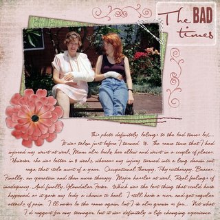
 Background and Mat paper from Jen Wilson's Layers upon Layers collection, Meadow Fair. Flower and centre from her Scrap Street florist. Stitching from Kim Christensen's Dirty Shirt elements (re-coloured). Doodles by Angie Briggs. White frame by Michelle Coleman (ATC Brushes). Stitched corner from SomethingBlueStudios.com. Inked edge action from AtomicCupcake.com. Fonts are AL Professor, AL Sandra and LoveMeAvenue.
You've seen some of it already. 4 of the new Jen Wilson Layers upon Layers sets. And her flowers. Kim Christensen's great Dirty shirt papers and elements too.
So here's some more layouts using them all. Some of them I've been tweaking for a while, and I'm just going to have to say ENOUGH. For better or worse they are done.
 Dotted papers, elements, stitching etc from Kim Christensen's Dirty Shirt set. Background paper from Trish Jones (Family Portrait I think) Eclectic Mix Cd. Inked edge action from AtomicCupcake.com. Fonts used are AL Postmaster, 4990810, AL Charisma and bulky Refuse Type.
 Papers, stitching and elements all from Kim Christensen's Dirty Shirt pack. (Plain blue is recoloured). Fonts used are Mailart Rubberstamp, LoveMeAvenue and SBC Love Mom.
 Background paper from Black Elegance set by Jen Wilson. Small square paper from Highland Mountain from Jen Wilson's Layers upon Layers collection. Font used is LoveMeAvenue.
 Background and Mat paper from Jen Wilson's Layers upon Layers collection, Meadow Fair. Flower and centre from her Scrap Street florist. Stitching from Kim Christensen's Dirty Shirt elements (re-coloured). Doodles by Angie Briggs. White frame by Michelle Coleman (ATC Brushes). Stitched corner from SomethingBlueStudios.com. Inked edge action from AtomicCupcake.com. Fonts are AL Professor, AL Sandra and LoveMeAvenue.
Meanwhile, it appears that I'm NOT one of the Best and Brightest, but I'm not losing any sleep over it. But that does mean that I can show you some of my layouts now, I hope. Keep your eyes peeled!


3 Comments:
Love the action in the boys' game ... real feeling of speed and excitement in your photos! Don't know how you could sit on these beautiful layouts and not share them ... :)
YES - said in my best tom cruise jerry vioce - SHOW ME THE LAYOUTS! ROFLMAO!!
Love all the new ones missy - the bad times is my fav!!
JUST AMAZING layouts!
Sandi
Post a Comment
<< Home