More holiday layouts!!
 I got this one done quite quickly yesterday. After all that photo posting I was in the mood for some fun. Used Jen Wilson Layer's collection again for those awesomely coloured/textured papers. Fonts were ummmmm Carpenter ICG and Century Schoolbook.
 I am such a lucky digi-scrapper. Not only am I getting SOO much satisfaction from doing something that I love, but I get to "meet" some pretty amazing people too. One of those is Amy Knepper, my "boss". She is a fantastic designer, and a wonderful person too. She asked to borrow some holiday photos to have a play, and used them as the inspiration for her new kit!!
So of course, I am now starting a NEW holiday album, all co-ordinated, for our whole holiday, not just a few special photos. Stay tuned for the layouts, which I have already started on, but in the meantime, head on over to Digitals or to ScrapDish and check out the new kit!!
{{hugs}} to you Amy, I love my present!
Ok, I can't go without one more layout... I've just been churning them out lately. But they don't feel "mass-produced". I'm just lucky to be in a creative hot-spot at the moment. I think it's the move of my desk (thanks *skip*) to a more creative spot in the house!!
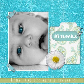
 Once again darling little Remy. I made the background myself with one of Dianne Rigdon's brushes. The other elements are by Holly McCaig, the original Digi Chick, and the flower is from another kit called Grandeur of Spring that I dont' know who made.
I made this layout to kill two challenges with one stone so to speak - font challenge at SBB, and weekly challenge at Scrapboxx. The font of choice was FB Flamingo (used for "16 weeks") and the weekly challenge was to use Aqua. And don't tell me that this isn't Aqua, cos I really don't want to know! :P
Have a great night everyone!
C


6 Comments:
Hey cass, i was just admiring your 16 weeks layout on the Boxx and found your blog.
Hope you don't mind me snooping around in here every once in a while. ;)
Hi Cass, just leaving a comment - just so you know Im not your stalker - LOL!!!! It was great "meeting" you tonight and am looking forward to chatting again soon!
Hi Cass, your photography is beautiful & your layouts are great too.
Great chatting with you tonight too.
Those blue eyes ... wow! Gorgeous layout of Remy! You are scrappin' up a storm! :)
I still love that first one - have you printed it out and framed it yet!!!! ROFL
Aw, you're too sweet to me, Cassie! I'm glad you're enjoying the new kit. Your vacation photos are just gorgeous, and I love the latests layouts!
Post a Comment
<< Home